

104.6. Plot histograms and heatmaps#
For the Portal Aspect of the Rubin Science Platform at data.lsst.cloud.
Data Release: DP1
Last verified to run: 2025-06-30
Learning objective: Create histograms and heatmaps in the results active chart.
LSST data products: Object table
Credit: Originally developed by the Rubin Community Science team. Please consider acknowledging them if this tutorial is used for the preparation of journal articles, software releases, or other tutorials.
Get Support: Everyone is encouraged to ask questions or raise issues in the Support Category of the Rubin Community Forum. Rubin staff will respond to all questions posted there.
1. Log in to the Portal aspect of the Rubin Science Platform and execute a query. Go to the Portal’s DP1 Catalogs tab, switch to the ADQL interface. Copy-paste the query below into the box, which will retrieve g- and r-band magnitudes for a sample of extended objects (galaxies) with fluxes greater than 360 nJy. Click “Search”.
SELECT coord_dec, coord_ra,
g_cModelMag,
r_cModelMag,
g_extendedness,
r_extendedness
FROM dp1.Object
WHERE CONTAINS(POINT('ICRS', coord_ra, coord_dec),
CIRCLE('ICRS', 53.0, -28.0, 0.3)) =1
AND g_extendedness = 1
AND r_extendedness = 1
AND g_cModelFlux > 360
AND r_cModelFlux > 360
2. Add a new chart, and choose histogram.
The default plot in “Active Charts” panel shows the number of objects as a function of position in the selected region.
In the Active Chart panel, click on the “+” button in the upper-left corner of the panel.
In the “Add New Chart” pop-up window select “Histogram” as the plot type and enter g_cModelMag as the column (Figure 1).
Click “OK”.
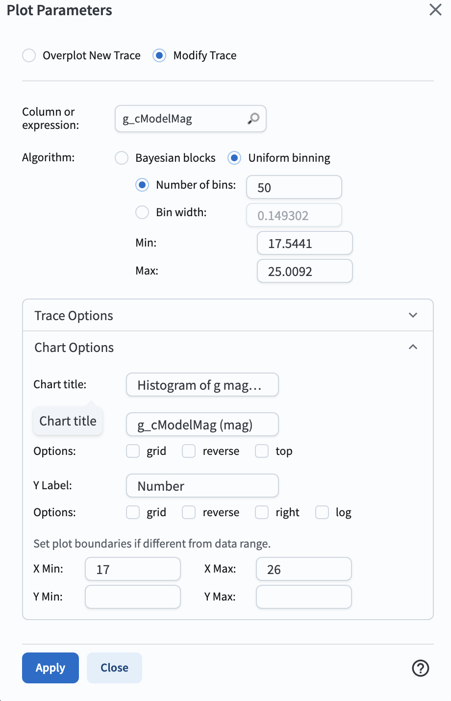
Figure 1: The “Add New Chart” pop-up window, set up for a histogram.#
3. Delete the default chart.
Remove the default plot of coord_ra vs. coord_dec by clicking on the “x” in the upper right corner of the plot.
4. Add a new chart, and choose heatmap.
Open the “Add New Chart” pop-up window.
Select “Heatmap” as the plot type and enter g_cModelMag for X and the expression g_cModelMag - r_cModelMag for Y (Figure 2).
Leave the Color Scale as “Default”.
Click “OK”.
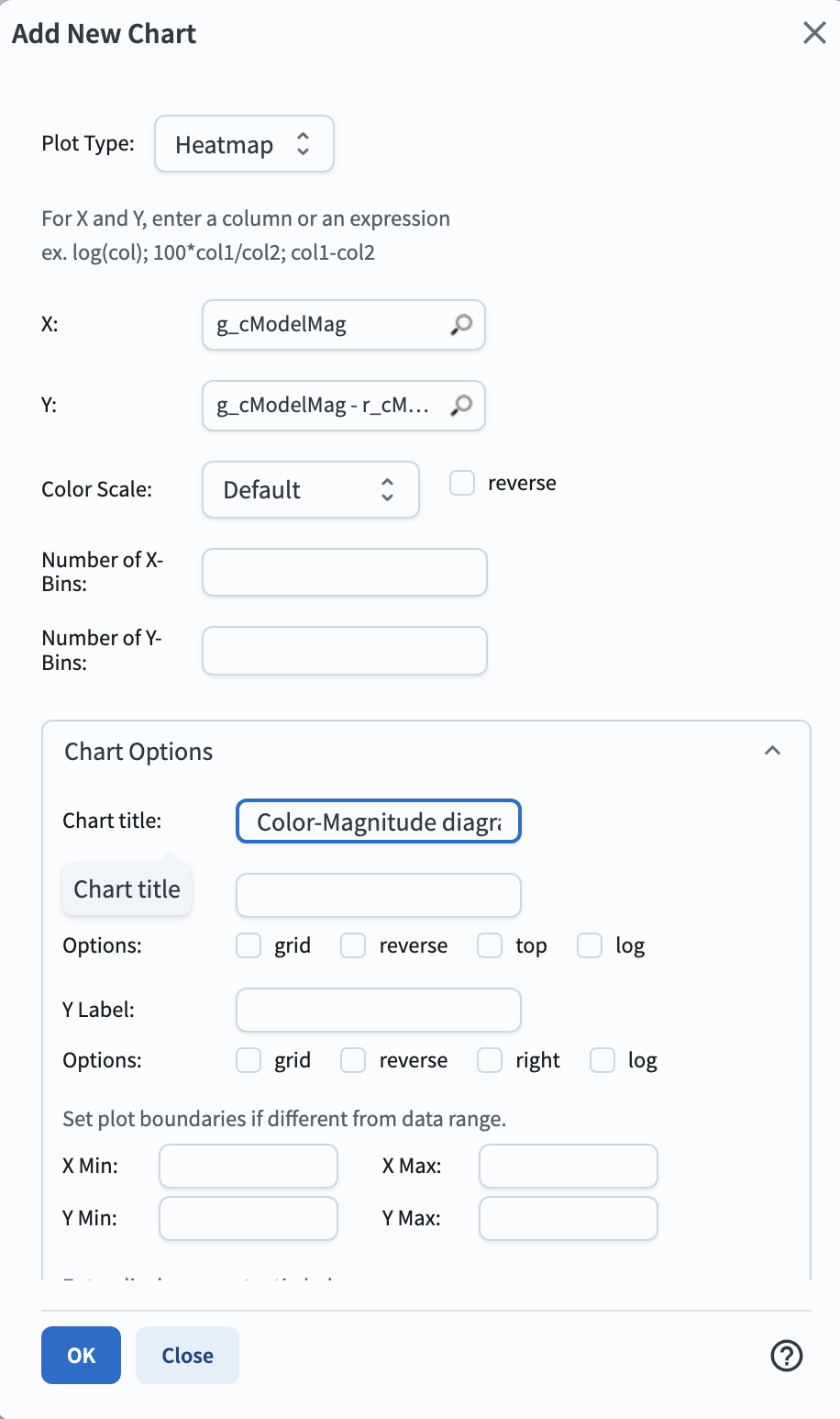
Figure 2: The “Add New Chart” pop-up window, set up for a heatmap.#
5. View the histogram and the heatmap. The Active Charts panel now displays a 1-dimensional histogram of the g-band magnitudes at left, and a 2-dimensional histogram (a heatmap) of the g-band magnitude vs. the g-r color at right, as in Figure 3.
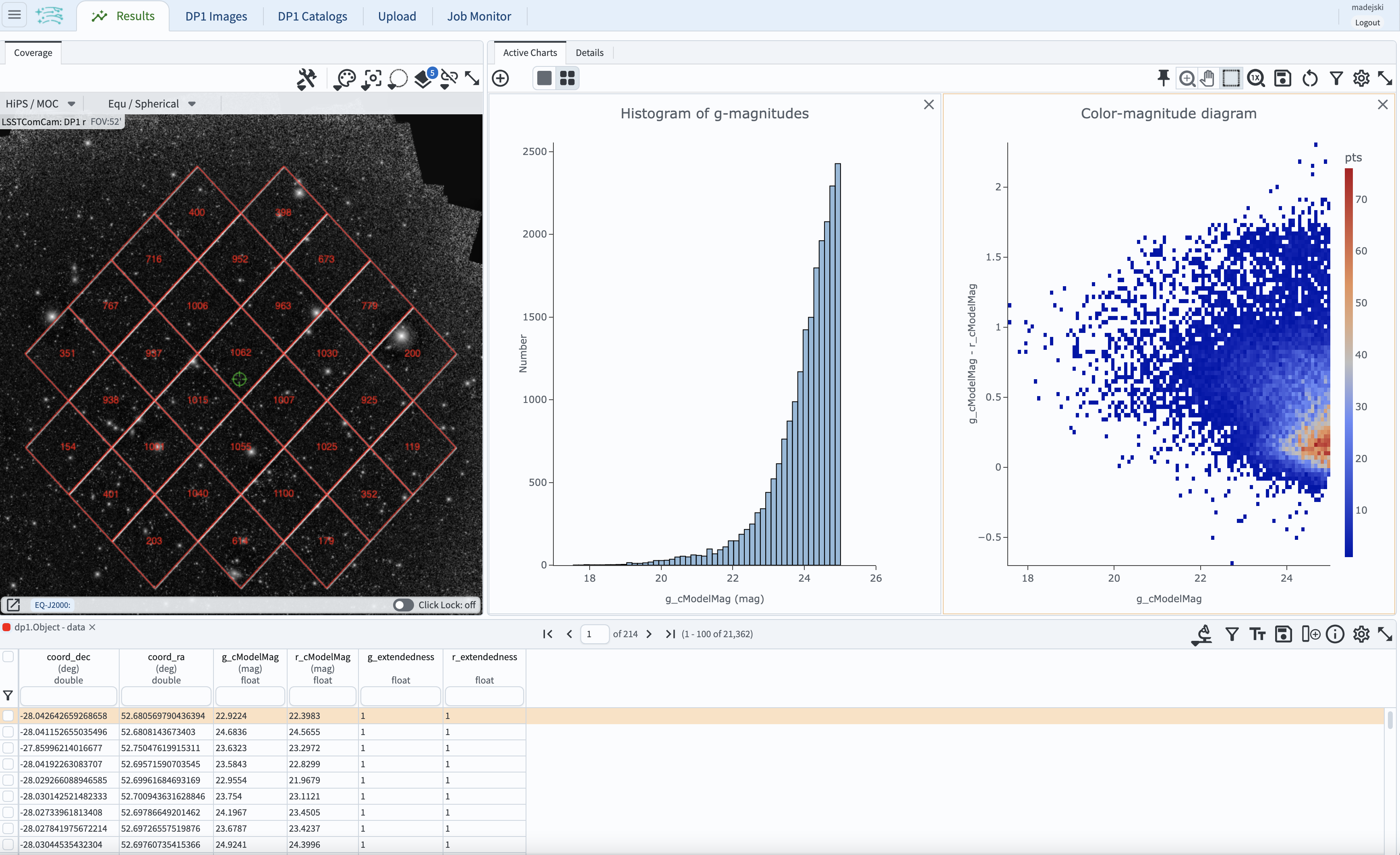
Figure 3: The Active Charts panel displays the g-magnitude histogram and the color-magnitude diagram.#